
How to Read Stock Charts When Trading
Prepared by the Libertex team
Content reviewed internally in accordance with regulatory standards.
If you're new to trading, you may have some questions about where you should begin. With so much information on trading and the stock market in general, getting started can often feel daunting.
This article will take you through the basics of how to read charts for trading. If you can read stock charts and correctly interpret the information represented on them, this increases your chances of placing wise trades.
So, if you want to know more about how to read charts and how to understand the data presented on them, read on!
Types of Stock Chart
There are four main types of stock charts: bar charts, candlestick charts, line charts and point and figure charts. Each type has its benefits, and as you learn more about them, you may find that you prefer one type over another.
This section will explain a little about each chart type and why they are useful.
Bar Charts
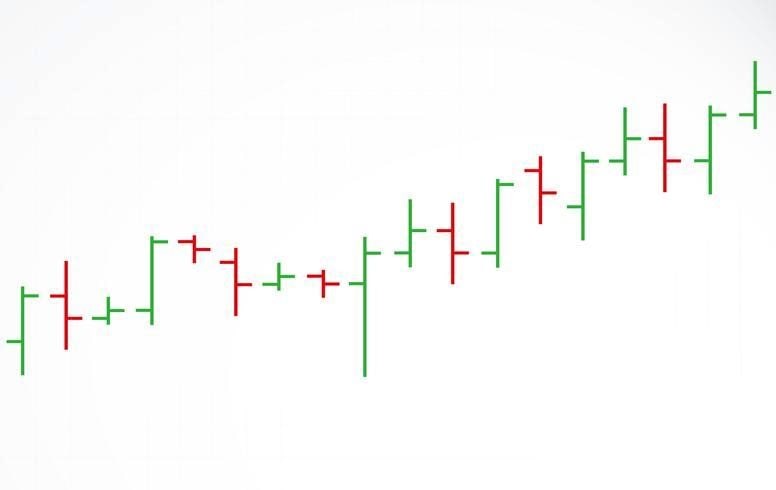
Bar charts allow you to determine four bits of information for the trading day:
- The opening price
- The closing price
- The highest price
- The lowest price
Bar charts can be used to display different lengths of time. They might break down price action over weeks or over minutes. It all depends on what's more useful for the trader.
You should be able to learn how to read bar charts fairly quickly because they have a clear, stripped-back layout. Each day is represented by a vertical line. This line shows the trading range of that day (or week, or hour, depending on the timeframe the chart covers). Two horizontal lines stick out from the vertical bar, one pointing left and one pointing right. The former indicates the opening price of the day, while the latter indicates the closing price.
These types of charts are particularly useful for analysing trends. You can use them to try and find possible trend reversals or to keep an eye on price movements and volatility.
Candlestick Charts
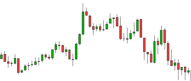
Candlestick charts present the exact same data as bar charts, but the information is displayed in a different format. Each period of time is depicted as a candlestick made up of two parts. The first part is a rectangle, called the "real body", that shows the range between the opening and closing prices. If the closing price is higher than the opening price, the real body is green; if it is lower, then the body is red.
The second part is a thin line extending from this that shows the high-low price range, known as "the shadow". You'll notice that the shadow sticks out both the top and bottom of the real body; the part that sticks out the top is known as "the wick", while the part that sticks out the bottom is called "the tail".
Candlestick charts are used fairly often by traders. This is because they impart a lot of information. The length and colour of a candlestick can instantly let you see what direction the market is moving in and whether it is weakening or strengthening.
Line Charts
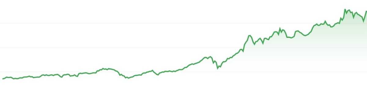
Line charts are the most straightforward form of stock market chart out of the four we have considered. A line chart can only be used to show daily closing prices. Closing prices are plotted onto a chart and connected with a single line.
Even though a line chart doesn't convey as much information as a bar or candlestick chart, line charts are still quite useful. They allow traders to instantly get an idea of a security's overall performance over a given time period without being overwhelmed by irrelevant pieces of information.
That said, some traders need the additional information provided by charts like bar and candlestick charts to deploy their methods well. Line charts may be useful to some but not to others. When it comes right down to it, the matter is entirely subjective.
Point and Figure Charts
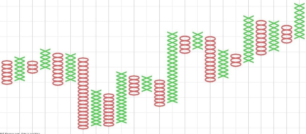
The final type of chart this article will consider is the point and figure chart. This type of chart is solely concerned with the price of a security and doesn't take into account volume or time.
Point and figure charts use Xs to symbolise price increases and Os to symbolise price decreases. Using this method, it can be easier for traders to identify trends and trend reversals. That said, since this type of chart doesn't record time, it can't be used to determine how long it may take for certain goals to be met.
There are several benefits to point and figure charts, even despite this limitation. For one thing, because these charts are limited to showing price increases and decreases, they can help traders focus on important market movements and visualise support and resistance levels.
Basic Stock Chart Terms You Should Know
Now that we've gone over the different types of stock charts you might come across, this section will explain a few basic stock chart terms you should know. Having a firm grasp of these ideas is essential to explore the market:
Open, high, low and previous close
These terms are used to describe price movement during market hours. The open is the initial price a security trades at when the market opens. As you may have guessed, high and low refer to the highest and lowest price points the stock reaches during market hours. Finally, the previous close is a term used to refer to the final price of the security in question at the end of the previous trading day.
Market cap
Short for "market capitalisation", the market cap of a company is a measurement of its size based on the number of outstanding shares it has on the market multiplied by the company's share price. A company's market cap represents the total market value of a business' outstanding stock.
PE ratio
PE ratio stands for price-to-earnings ratio. Sometimes traders use the PE ratio to decide whether or not a stock has been fairly valued.
Dividend yield
An annual dividend yield is the amount of money a trader receives annually from dividends — profits distributed from a company to its shareholders. It's given as a percentage of the company's current share price.
Bid and ask
A bid is a term used for the maximum price a trader will pay for a particular stock. If you see a price listed as the bid, that means traders are willing to pay that current price for a share. While a bid is the highest price a trader will pay for a stock, the ask price is the opposite. The ask price represents the absolute lowest price a trader will sell a particular stock for. You might see the term "bid-ask spread" mentioned regarding stocks. This is the difference between the bid and the ask.
Volume, average volume and day range
Volume refers to the number of shares that have been traded during the market day. As the name implies, average volume refers to the average daily volume of shares traded during a specific duration of time. The day's range refers to the stock's highest and lowest prices on a given market day.
Beta
A stock's beta value is a measurement of its volatility when compared with the market. The beta gives traders an idea of how risky it is to purchase shares in that stock. If a stock's beta is more than one, this indicates that it has been relatively volatile in the past when compared to the market. If the beta value is less than one but more than zero, this shows that when compared to the market, it has been less volatile.
Earnings per share
Otherwise known as EPS, a company's earnings per share is the amount of profit per outstanding share made over the past year. You can figure out a company's EPS by dividing its most recent company earnings by the number of shares they have listed on the market.
Ex-dividend date
To get dividends from a company for the next business period, you have to make sure to purchase stock before the ex-dividend date. If you become a shareholder after this date, or even on the day, you'll miss out on that period's dividend.
One-year target estimate
This term is quite self-explanatory. A one-year target estimate is an approximation of what a stock's value might be in a year's time. While such forecasts can sometimes prove useful, a one-year target estimate is just that: an estimate, not a guarantee.
How to Read and Interpret Charts Using Technical Analysis
This section will explain how to read and understand trading charts by analysing statistical trends to try and identify potential entry and exit points. For example, traders might examine fluctuations in stock volume or price, using trends and patterns to determine how the stock might behave going forward.
Patterns in stock market movements can be categorised into two groups: continuation and reversal patterns.
Continuation Patterns
Continuation patterns indicate that a particular price trend will probably remain steady. They are found in the middle of a trend and signal to the trader that the trend will most likely continue once the pattern has been completed. Continuation patterns can be found on daily charts, weekly charts, and even tick charts.
Let's now consider five commonly occurring continuation patterns that traders look for and work with: pennants, flags, wedges, triangles and cup and handle.
Pennants
Pennant charts are plotted with two trendlines — an upward and a downward trendline — that converge at a point. They are drawn when the volume or value of a security sees a particularly dramatic movement and is then followed up by a consolidation period and a further breakout period where the market moves in the same direction as before. Converging trendlines are drawn during the stock's consolidation period to try and determine when the next peak in value or volume will be.
Flags
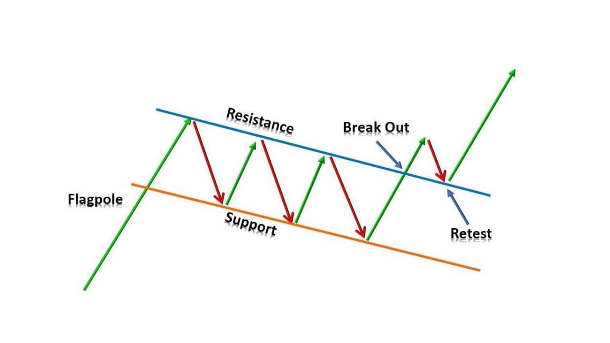
With flag charts, two parallel lines are plotted onto a chart. These lines may slope up, down or diagonally. A flag chart that slopes downwards usually indicates a pause in an up-trending stock market, while the opposite is true of upward-sloping flag charts. Flag charts are used to try and determine the likelihood of a previous trend continuing.
Wedges
Like pennant charts, wedges are also drawn with two sloped, converging trendlines. Unlike with pennant charts, however, the trendlines on a wedge chart both move together in the same direction. Wedge charts that slope downwards indicate a pause in the middle of an uptrend, and the opposite is true of upward-sloping wedge charts. These types of charts are especially useful for forecasting future price reversals.
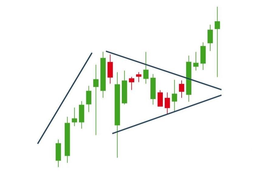
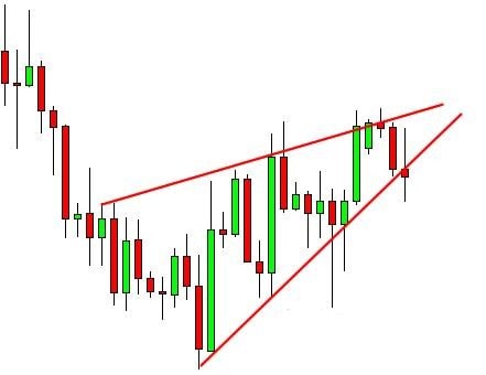
Triangles
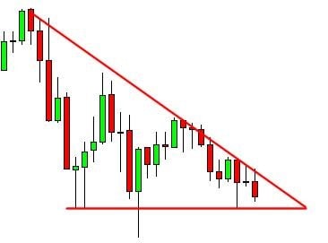
Triangles are an extremely popular type of chart among technical analysts. This is because, compared to other patterns, triangles appear relatively frequently. There are three kinds of triangles most typically encountered by stock chart analysts: ascending triangles, descending triangles and symmetrical triangles.
Ascending triangles include an ascending lower trendline that converges with a flat upper trendline. These types of triangles suggest that an upward breakout is quite likely. Descending triangles are instead characterised by a downward sloping upper trendline and flat lower trendline and usually suggest that a breakdown is imminent. Finally, symmetrical triangles are characterised by two sloped, converging lines. These types of triangles indicate that a breakout may occur but not in the direction one will occur.
Cup and Handle
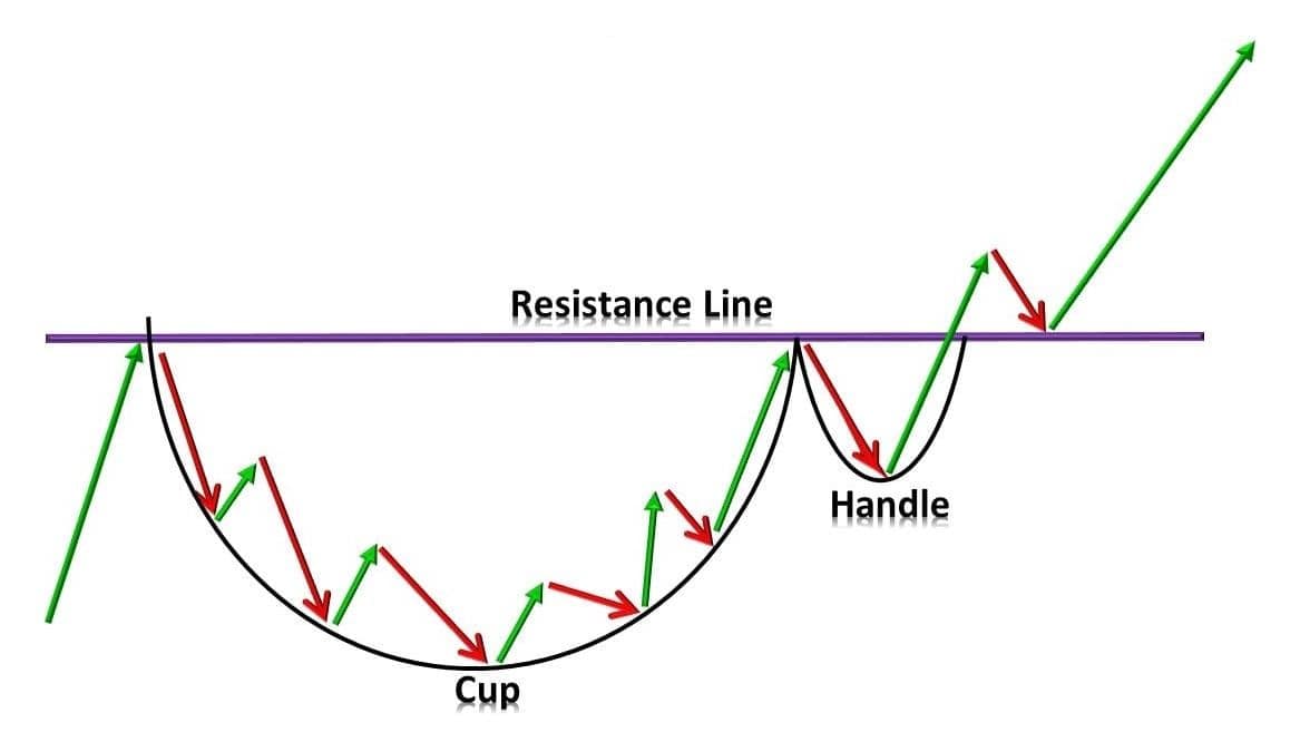
A cup and handle chart is a pattern that appears when an upward trend has momentarily paused but will soon continue. The name refers to the shape of the chart, with the "cup" referring to a U-shaped line on the chart and the "handle" referring to a breakout that sticks out from the cup in a similar shape to a flag chart. Traders use cup and handle charts to determine whether or not they should go long on a particular stock.
Reversal Patterns
Reversal patterns are chart patterns that indicate a change in a particular trend. This trend will come to a stop before heading in a new direction — rising or falling depending on whether the market is bullish or bearish. When stock prices reverse after this pause, the resultant pattern is known as a reversal pattern.
This article will now consider four different kinds of common reversal patterns: head and shoulders, double top, gaps, and bull and bear traps.
Head and Shoulders
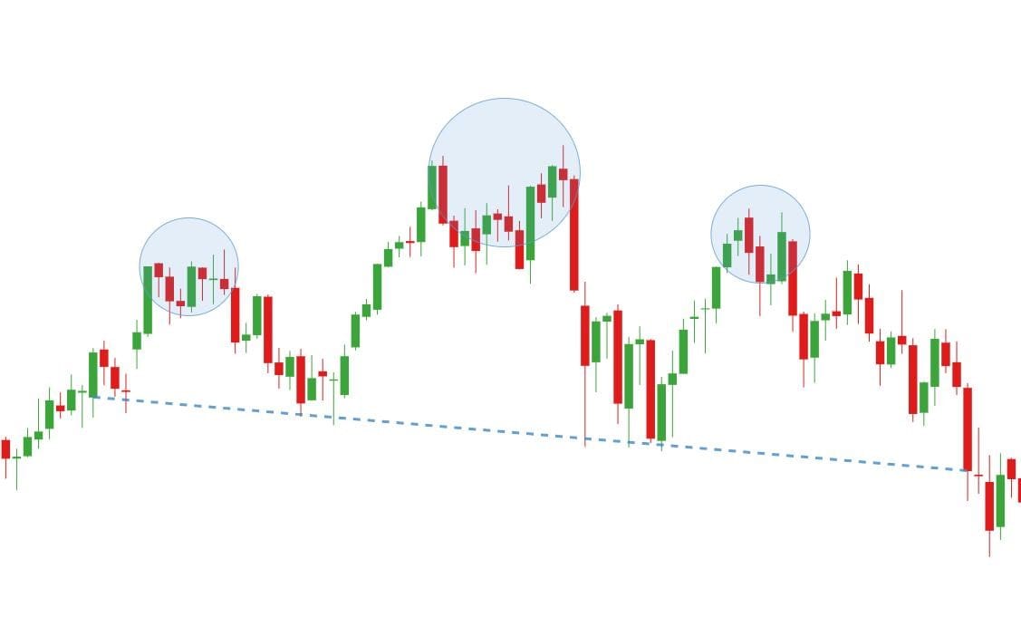
Head and shoulders appear either at the top or bottom of the market. They are characterised by a small peak or dip, followed by a larger one, and finally a smaller one again that appears similar to the first. A head and shoulders pattern may indicate a trend reversal and is widely considered one of the most reliable types of trend reversal patterns.
Double Top
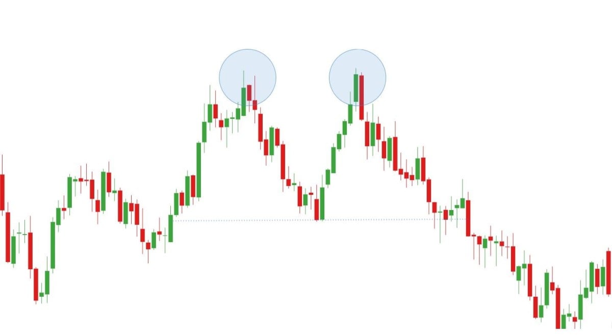
A double top pattern on a market chart indicates a point where the market has tried two times to breach a resistance or support level and has failed. Double tops look similar to the letter M, while the inverse, the double bottom, looks more like the letter W. The former indicates that the market has tried to push up through a resistance level. The latter signals that it has instead attempted to push down through the support level.
Both double tops and double bottoms serve as useful indicators of trend reversals.
Gaps
Gaps can be observed on stock charts when a relatively large decrease or increase in value causes a break between two separate trading periods. There are three kinds of gaps to be aware of: breakaway, runaway and exhaustion gaps. Breakaway gaps occur at the beginning of a new trend, runaway gaps in the middle of one and exhaustion gaps towards the end. While it's not difficult to identify gaps in the market, it's a great deal more difficult to determine what sort of gap it is, meaning you won't be able to play the gap each time.
Bull and bear traps
Bull and bear traps are false indications that a particular asset is bullish or bearish, often induced by companies. In the case of the former, the security appears to be climbing higher and higher in value, tempting traders to join. When the trend abruptly reverses, however, traders must pull out of the trade or else get caught in a long position.
Bear traps are the opposite of bull traps. The market appears to be declining, and so traders make short plays in hopes of making a profit off the asset's drop in price. In the end, though, the security continues increasing in price, which means these traders miss out.
Since bull and bear traps are by their very nature unpredictable, it can be difficult to spot them. However, with rigorous application of technical and fundamental analysis, you can hopefully avoid falling for potential traps.
The Bottom Line
To identify stock chart patterns, it's important to pay attention to the movement of trendlines. Through the application of technical analysis, you can use stock chart patterns to forecast future market behaviour.
There is no guarantee your prediction will be 100% accurate, but if you practice technical analysis, you may one day be able to successfully predict trend reversals and continuations.
Conclusion
This article has gone over the basics of how to read technical charts and has provided a few common examples of stock chart patterns. We'll leave you now with a few common practices for reading and analysing stock market charts:
- Identify the trendline. You can't find patterns in stock market charts without first identifying the trendline. Practice looking at different sorts of graphs and trying to interpret them to get comfortable with them.
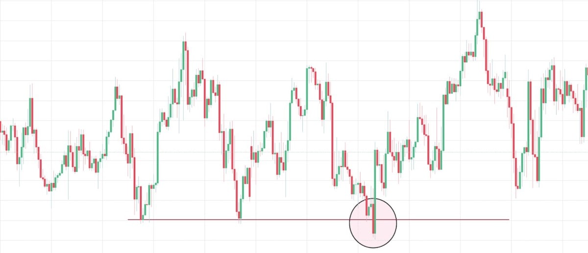
- Look for lines of support and resistance. Another important feature to be able to identify is support and resistance lines. The support line is the point at which the market stops falling and starts to rise again. The resistance line is the point at which the market stops increasing and begins to drop again.
- Know when dividends and stock split occur. When dividends and stock split occur, the overall value of a business isn't affected, but its share price might be. Oftentimes, when a stock split comes about, the share price drops, so you'll usually see an increase in the trendline.
- Understand historical trading volumes. There isn't always a direct correlation between trading volume and stock value, but it's still useful to have an understanding of previous trading volumes.
FAQ
How do you read a trading chart?
To read a trading chart, you need to identify and understand some key features. You must identify trendlines and lines of support and resistance and must have a firm grasp of historical trading volumes, dividends, and stock splits. If you know about these key principles, you'll know what to look out for on a stock chart and be able to filter out the rest.
How do you use charts in trading?
Stock charts are a crucial part of technical analysis. By learning how to understand trading charts, you'll be able to forecast future market movements with a greater chance of getting them right. This helps you decide how and when to buy or sell assets
How to interpret stock charts
Once you're able to read stock charts, you must be able to understand and interpret them correctly. The easiest and most reliable way to do this is to look for trendline patterns. Stock chart patterns sometimes hint at what the market may do next.
What timeframe is best for intraday trading?
Intraday traders most frequently use 15-minute and 30-minute timeframes. That said, some intraday traders use timeframes as short as 5-minutes, others as long as 60-minutes. 15-minute or 30-minute windows are long enough for traders to get a sense of market movements but short enough for them to still find lots of entry moments throughout the day.
Disclaimer: The information in this article is not intended to be and does not constitute investment advice or any other form of advice or recommendation of any sort offered or endorsed by Libertex. Past performance does not guarantee future results.
Why trade with Libertex?
- Get access to a free demo account free of charge.
- Enjoy technical support from an operator 5 days a week, from 9 a.m. to 9 p.m. (Central European Standard Time).
- Use a multiplier of up to 1:30 (for retail clients).
- Operate on a platform for any device: Libertex and MetaTrader.